Marko Anastasov wrote this on July 4, 2014
Redesigned: The New RenderedText.com
This week we’re very excited that we launched a brand new design of renderedtext.com.
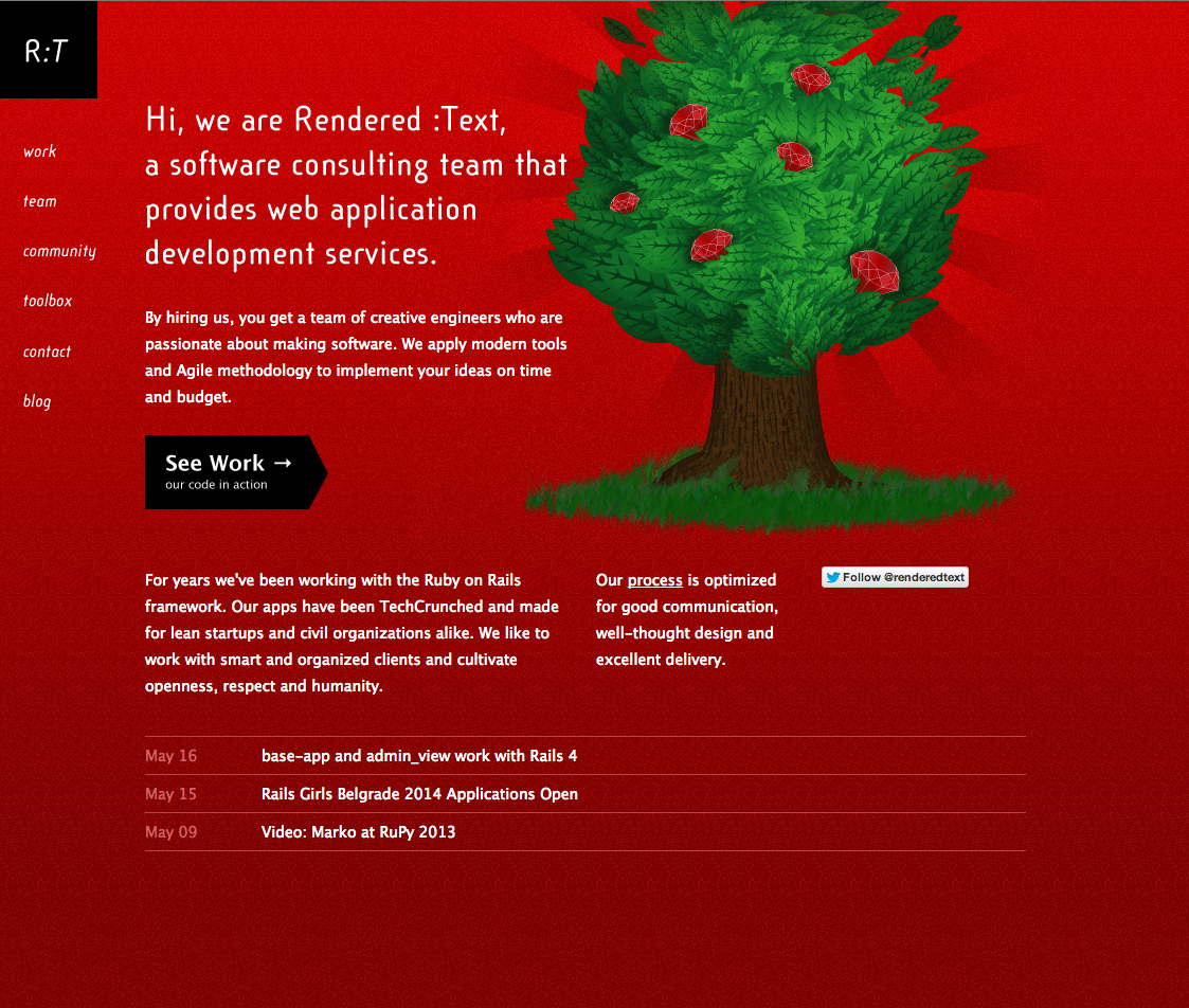
Our website looked like this for a very long time:

It was a great representation of us back around 2009-2010: a small and lean team doing full service web development. The layout was optimized for a few pages as they were conceived at the point of design and while we loved it, it was not flexible enough for new content ideas. As a result everything but the blog has eventually become out of date.
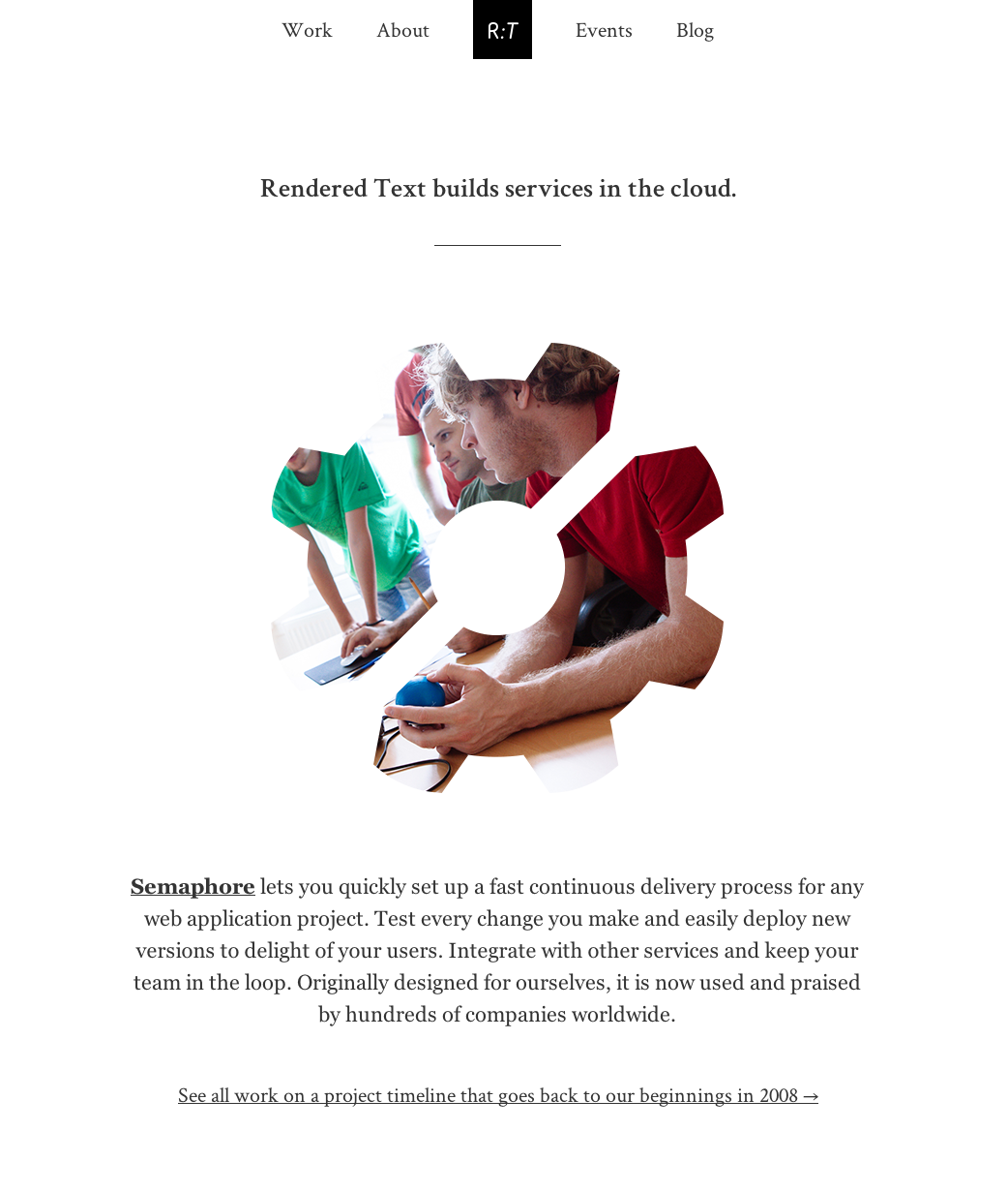
The new site looks like this:
The first thing you see is us, as our goal was to tell you more about who we are.
Nowadays there are always some events which we are either organizing or attending, places where you can meet us. So we are introducing a new section for events, with it’s own RSS feed which you can subscribe to. Our blog feed remains the same, however the fate of FeedBurner is questionable so we now encourage you to subscribe directly to renderedtext.com/posts.atom.
Visually, we looked for style over fashion. A layout that is simple, text-driven, pleasant to read and free from elements which look cool only to become passé soon.
We hope you like the new design. Our sincerest thanks goes to Superawesome for the collaboration on design and Nikola Bradonjić for photography. And to you — for listening.

